After very popular airbrush tutorial from last time I’ve noticed that people interested in airbrushing like more then anything else tutorials which provide great information where they are actually able to learn new things. There are great tutorials out there on Internet (mostly videos) and sometimes it is almost impossible to find and follow all of them, that’s why I’m trying to share my finds with my audience.
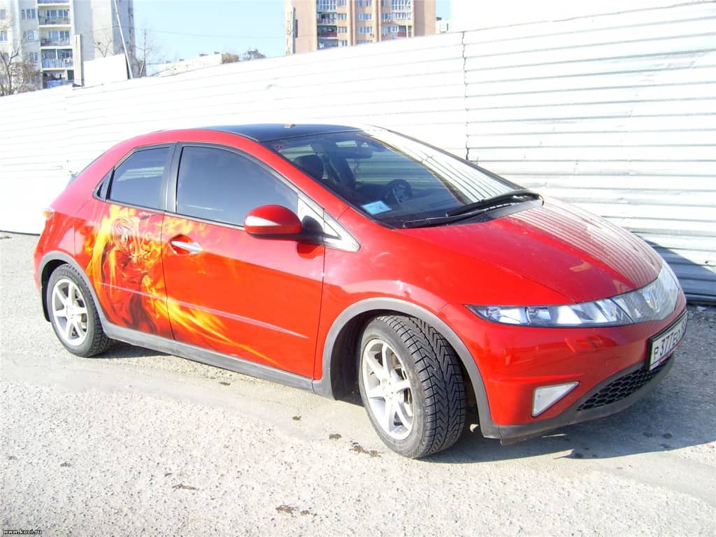
Today’s “how to” is for everyone afraid of giving their car very contrast look. You can actually keep your car in same color you have now but still make it different and stand out from the crowd. The author is Anton Kuyanov from Novorosiysk in Russia. Enjoy!
Airbrushing Red on red!
Hi there!
Of course it’s just an allegory because we are not going to paint with red color at all but we are going to mix a lot.
Tools used:
Iwata HP-SBS Auto Graphics 0.35mm;
Iwata HP-SB Plus 0.2mm;
Iwata LPH-50-0622G 0,6mm;
SATA RP 1,4mm;
Paints and other materials:
Scotch-Brite (grey one), abrasive paste, degreaser, slow drying thinner, cleaning solution, sticking tissues, textile wipes, masking tape, masking foil and some old newspapers or magazines ;).
DeBeer paints, base coat, opaque white, opaque yellow, ocher, brick red, green, blue, binder.
Candy concentrates: yellow and orange.
Not really needed stuff: Laptop or PC and projector.
Here is the design:

The model is undressed and ready.
Light on!…
ACTION!!!
As usual, first step is to get rid of glance using Scotch-Brite with abrasive paste. Now, for those who love comfort and can afford to use projector you can project your design right on the car but be careful as sometimes you can lose proportions and it will look like really bad art.
Now we can start very easy (just not to make a lot of fumes as those may be sucked into the projector) sketching up the most bright parts with half opaque white base coat paint.
Because the door isn’t flat you can’t sketch up all the stuff, so use your head and hands and do it the old way – some with stencils, some free hand.
Everything with white base – bottom layer and bright parts.
Here I’ve tried to use the half-opaque ocher and brick red color DeBeer to see how it looks.
To be honest I didn’t like it so in this case just take thinner and textile wipes and wipe it down. First I wanted to wipe the whole door but then I decided to get rid of just some parts and I’ve spent some ridiculous long period of time doing this.
Here I was experimenting with white and half opaque colors, sometime candy (yellow and orange DeBeer) for this kind of effects.
Even the door handle so it won’t stick out.
Now we got to the face.
All free hand, I’ve also spend some time making shadows on clothing.
If you used projector try to step away and see how it looks. You may need to fix all the errors created by projector, as you are not projecting on the flat surface some parts may be wider as they should be. This will require free handing again.
Work with head.
The sword, reflections on it, textures.
Adding details and blinks.
Here’s one special effect. With help of rubber glue (or glue for rubber to be exact) I’ve made a texture.
All I did is to put the glue with my finger onto surface and waited until it’s dry (you can even blow on it) then I rub it on in direction that was required. Because the glue is dry it creates interesting cracks.
Then we have to spray over with white base and take off the glue. I did some free-handing over it after all.
In the process there is always a time when you have to check it out and think it through if the art is complete or if there is something missing. Also don’t forget to leave your footprint.
Snaps without and with clear coat and all back in place – the final result.
My conclusion
As for myself, I actually find out that if you work on non-flat surfaces and especially with accent on proportions, then you better not use a projector but for background stuff it’s very good help.
Also when talking to customer, reserve some more time for yourself in case of need to experiment and not to be afraid to deal with errors and avoid getting into troubles. You still can wipe everything off with reducer.
If you haven’t notice, just to point it out, I didn’t use black color at all, here I use and recommend for you too – blue, green and violet.
 Author of tutorial – Kuyanov Anton (Куянов Антон) – www.art-ka.ru
Sergej here. Do you like this tutorial? I love it! I’ve found some great tips. If you like it or know about someone who may like it too, please spread the love and share!


